When pleasing to the eye and pleasing the shareholders are two very different things.
In my line of work I see a lot of interesting booths and exhibit ideas. It’s a treat to see the innovation and thought that is put into the design of modern day exhibits.
However, the constant battle between form and function is ever present. Usually there is a sacrifice to be made one way or the other.
Does the Beautiful Trade Show Booth Always Mean the Profitable Booth?
No it doesn’t. For example, I was just recently at VMworld 2015 in San Francisco, and came across this beautiful looking booth from Palo Alto Networks. The “wood look” was a real departure from all the other booths who are still doing the “Clean, White Apple look”. As interesting as the booth looked, a voice in the back of my head said “good luck getting booth visitors in there”.
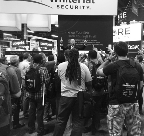
As a Trade Show Infotainer, I’m hired to not just communicate my client’s message in an entertaining way, but to create a crowd of interested on-lookers and generate sales leads out of seemingly nothing. My experience in working in dozens and dozens of booths told me that even with an entrance on each of the four sides, it was not a very welcoming booth to visitors. Entering a booth with walls requires a level of commitment. Attendees are always leary of getting “sucked into” a presentation that they can’t easily escape. In my Trade Show Traffic Secrets ebook I wrote about how attendees will always take the path of least resistance and in this case, not enter the booth.
This past year at Distributech 2015, I saw a similar booth layout that had only one entrance. In the center of the booth was a presentation area. As I was walking down the aisle with a fellow trade show presenter, we both noticed the booth layout, looked at each other and laughed, knowing that very few attendees would willingly go into a booth like that. I checked in with that company at the end of the show and they admitted that their presentation attendance had been a lot lower than they would have liked.
I offer these examples as a word of caution to events managers and the executives who oversee them. Your company’s shareholders demand profit. That profit is created through the sales of your company’s products or services. Sales are created by converting leads that are generated through various marketing initiatives such as trade shows. The bottom line is that every booth decision you make must produce measurable results.
It doesn’t have to be pretty to work. Just make sure it works.
The balance between form and function is something I’m dealing with right now. I’ve just engaged a marketing firm to design a 6-page card stock folder brochure. They have shown me designs that look amazing and are pleasing to the eye, but then I challenged them on a few points. “How come these quotes don’t have names and companies associated to them, further building credibility? Where are the pictures that serve as legitimizers, demonstrating capability?” The answer I got was that the design they planned didn’t allow room for these elements. I sent them back to work on their design and with the task of including those elements that have been proven to influence sales: testimonials, and showing the end result.
Obviously I want to get the most out of my investment, so I want that marketing piece to “pull” as much as possible. I want the function to be high, and if the form side of things suffers, I can live with that. True, that might not be creatively fulfilling for the designer, but at the end of the day, you are the client and you need to demand results.
I encourage you to push your exhibit supplier and ask them what they have found to be the most successful designs, not in attractiveness, but in “attractfulness”. Did the exhibit create interest and was it well attended? Find out what has “pulled well” for other companies and repurpose those ideas.
The trade show industry is a big business and there are a lot of vendors out there trying to sell you on all the new shiny bells and whistles. There’s nothing wrong with bells and whistles, as long as all the noise is generating the results that you are looking for.


