

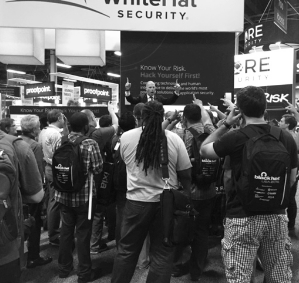

A great-looking booth and an engaging booth are not the same thing. Plenty of visually stunning booths still struggle to get attendees to stop.
Exhibitors often invest heavily in design elements that photograph well but quietly work against engagement on the actual show floor. The mistakes are rarely about taste. They are about how the space functions for a stranger walking by in a crowded aisle.
1. Closed-off layouts that block entry
A booth with a single narrow entrance or a counter blocking the front creates a physical barrier before a conversation can even start. Attendees who have to commit to walking around or through something are far less likely to stop at all.
2. Screens and messaging with too much text
Attendees are moving and reading in seconds, not minutes. Dense paragraphs on a monitor or backdrop go unread. A single clear phrase communicates more than a wall of product details ever will.
3. No clear focal point
When every element of the booth is competing for attention, none of them win. A booth needs one obvious place for the eye to land, whether that is a presentation area, a demo station, or a visual centerpiece.
4. Design built for photos, not for foot traffic
A booth that looks impressive in a rendering can still fail on the floor if it was not built around how people actually move through a crowded aisle. Sightlines, open access points, and where staff naturally stand matter more than most design mockups account for.
A booth’s job is not to look good in a photo. It is to make a stranger stop walking and start paying attention.
Want a booth that draws people in instead of just looking good? Book an Insight Session and we’ll help you rethink the layout.